The data was comprised of architectural plans for the new HOME building, structural specification documents, lots of written research feedback material, videos of projected footfall, branding guidelines, and CGI imagery. Our initial plan was to do something as data-driven as the hackathon project, but it quickly grew into a much more visual idea.
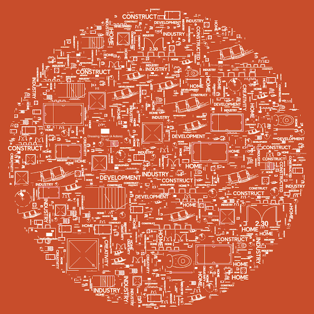
Our initial concept was to try and visually represent the ‘anatomy’ of HOME; the stuff that makes it tick, represented graphically. This took the form of an exploration into generating new physical forms from the data, comprised mainly of typographical elements and components from the architectural building plans. This generative output could then be framed with more traditional typographic or visual elements to create finished pieces.
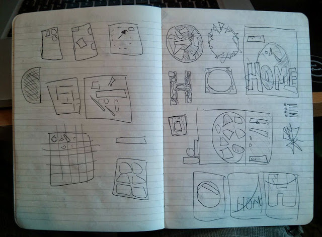
We started by manually creating a few test images, using randomised elements from the plans to form some rough typographic experiments, just to see how things looked:
The next stage was to put together a quick Flash prototype that generated these visuals for us, with configurable parameters. The code simply took a starting shape (a letterform for example), and iterated over shape placement until it had filled the space as much as possible. Below are a few sample images (ignore the item repetition, this was mainly a proof of concept):
At this stage I wasn’t super happy with the final imagery: it was interesting, but not as visually impactful as I was hoping for. However, I realised that actually the part I was really happy about wasn’t the final product at all: it was the process. The code is generating these images, not me, and I quickly realised that actually without showing the process to the viewer they were missing the point entirely.
So, we evolved the idea slightly, focusing much more on the generative aspects. We loved the typography and images, and wanted to create the same interesting forms, but we wanted to do it while still showing the generative steps to the viewer. Inspired by the work of Roger Alsing, I started experimenting with my own interpretation of genetic algorithms to create more visuals.
The idea is pretty simple:
- Give the program a target image (i.e. the one we’re trying to create)
- Create a blank ‘working’ image
- Draw a completely random shape onto the current working image
- Decide if the new working image is closer to the target than it was before we added the shape
- If it’s closer, save the image and go to step 3
- If not closer, discard the new shape and go to step 3
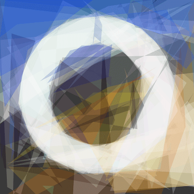
What this gave us was a program that over time would generate images that got closer and closer to the target image. There was no limit to how many times the program would run, it would just get closer and closer until I decided to stop it (or my laptop exploded). More importantly, this also allowed us to capture snapshots of the working image at regular intervals, allowing us to not just have a final image, but also an idea of steps that the program took to get there.
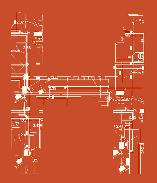
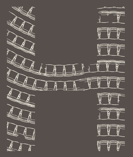
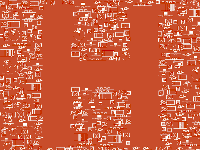
We then produced a series of experimental letterforms, and spent a while quickly running them through the algorithm's first few thousand cycles to find out which were most visually interesting when processed:
As we expected, the most effective ones had lots of color and contrast, so we went in that direction and produced four distinct typographical forms built on HOME imagery:
Once we had our final imagery, we needed to run them fully through the genetic algorithm code. First, we took our base image, which is then used as the target for the generative process to aim for:
The code was then left running until it had reached an interesting approximation of the image, capturing ‘in progress’ images at user-defined intervals. The final generated image in this instance was comprised of about sixty random overlapping shapes, had made around 40,000 cycles of generation, and took about ten minutes or so to create:
From here, we were able to produce ‘filmstrips’ of the process images for each letterform, both in a web-friendly resolution and also in ridiculously high res (this would allow them to be printed, or even just downloaded for a closer look):
We also put together a video showing the initial typographical images, along with animated versions of the letterforms quickly constructing and deconstructing. This really gives you a nice sense of what the program is doing in terms of it’s process, you can really see the shape emerging from what looks like randomness.
A note on the technical implementation: Roger Alsing’s experiments and open-sourced code formed the basic idea, which I then simplified greatly and re-built using C++ via OpenFL. We'll be open-sourcing the whole thing shortly so others can build on it too.






Love the final output. Good write-up on the process, as well!
ReplyDelete